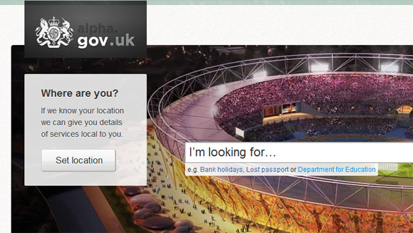
Late Tuesday night http://alpha.gov.uk - the centralised government website prototype - was made live. Although it is not a finished product and it wouldn't be fair to subject it to a full critique, I have put together some first impressions.

Content
The content is where alpha.gov.uk really stands out; the writing is clear, tight and to the point. It gives precisely what is asked for and nothing more, and still manages to sit in the sweet spot of simple and understandable but not patronising.
Services are categorised into types - guides, answers and tools (transactional services). This focuses the content, giving it a specific reason for existing and a clear outcome.
Location
Most centralised government websites depend heavily on the user providing their location in order to provide relevant content, and it is important that it works well. The alpha.gov.uk location service is basic at the moment, but shows a lot of promise. Telling the site where you are allows it to provide location-based information, for instance the details of your nearest police station when reporting a stolen passport, but the results are a bit hit-and-miss.
Search
Search is the primary method of navigation for alpha.gov.uk, it uses predictive search to assist users in finding services, but it doesn't appear to account for misspellings or synonyms (searching for 'bin' gives different suggestions than' rubbish') something we hope will be improved upon.
It also appears to index plenty of local government and public sector websites and presents results from them all, although it doesn't appear to take into account your location to filter the results (something that we guess will change).
Forms & workflow
Forms are designed to be clear and consistent, they provide information on how many steps and how long they expect the service to take. Longer forms are split into sections and pages, and have branching workflow.
Guides are split into pages with a quick navigation and orientation feature always visible. This is a step away from traditional hierarchical navigation and works well, in fact this is carried across most of alpha.gov.uk -services designed to fit a user's mental models rather than technology constraints or conventions.
Look & feel
Alpha.gov.uk's look and feel is far from a prototype. It sits comfortably between 'trusted' (large serif fonts and muted colour scheme) and 'approachable' (clean, clear iconography and logically sectioned content). The design feels modern and soft, with web fonts and subtle colours changing between site sections and departments.
There are some inconsistencies, particularly when sourcing data from elsewhere (some data appears in block caps), but for the most part the look and feel already feels mature and well defined.
There is one touch I particularly love the look of - the highlighted text which appears on some pages when information is critical.

Overall
It is a concept, a prototype, and although it is rough around the edges it carries with it so much promise. The team have created something that is very different from traditional government websites; they have made the most of a blank slate and have thrown many conventions to the wind.
We will follow shortly with a post about what we think alpha.gov.uk means for local government.
Get involved
The alpha.gov.uk team are asking for feedback on their Get Satisfaction account http://getsatisfaction.com/alphagov or their Facebook page http://facebook.com/alphagov