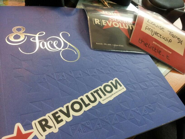
On Friday we attended the first all day web conference in Shropshire.
Project WIP team members helped out at the event with tasks such as registration and giving out goody bags, and we were lucky enough to sit in on a lot of the talks too. I've put all my thoughts from the day into this blog post and would like to thank all the inspirational speakers from the day.
I've taken a lot away from the whole (R)evolution event, which actually started the night before the conference at the smaller Shropgeek event called Rebellion.
Rebellion
Neil Kinnish and Pete Nelson from Mixture gave an interesting talk and inspired me to pick up some 'side projects' and "Have Fun". I'll be doing this in work, where I'd like the team to work together one day a week on a project that desperately needs doing, but always gets pushed down the list of priorities. I'm also hoping to pick up some old side projects of mine at home too.
(R)evolution
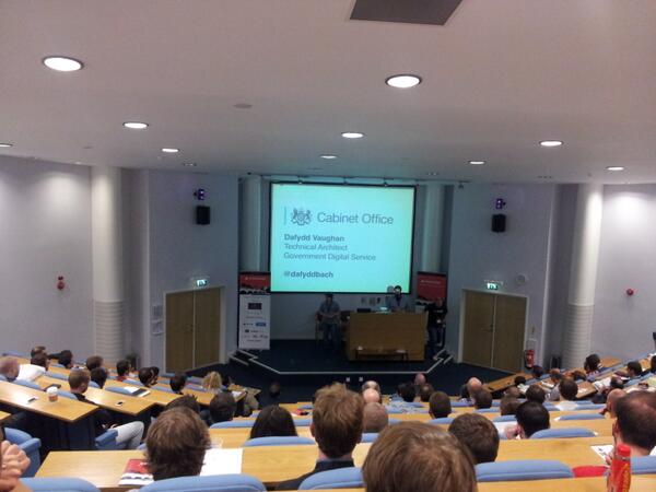
Dafydd Vaughan
Dafydd gave an interesting talk about the team behind gov.uk and how they operate, including how the team of designers, developers and content writers all work together.
Dafydd also told us about their new colleague, a toy badger - yes you read that correctly! Gov UK have a rule that, unless you are physically holding the toy badger, no work to complete a release is allowed. Dafydd, if you're reading this, I would love to know if the badger has a name.
Robert Mills
Robert spoke a lot of sense; he presented as though he was talking to me individually, which was great since his whole presentation was about tone of voice.
Robert has taught me that you need to find where you sit on the spectrum, from professional to fun. If you are a professional organisation there is no shame in putting yourself on the professional side of the spectrum. As Robert said, you wouldn't want a solicitor's website to be overly friendly, you want them to be professional.
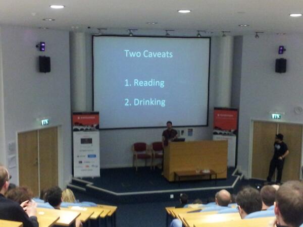
Laura Kalbag
Laura showed us some excellent examples of sites that weren't very accessible. Laura made me stop and think about sites I've designed over the years (she'll be happy to hear that I've started underlining links again in my own work).
She also got me thinking about the use of 'Click Here' and the fact that some users now tap! Will this be a historical reference that we will always use, similar to the way the floppy disc icon is still universally used to save, long after the floppy disc itself has faded into obsolescence? Laura also showed us examples of the mistakes designers make, and gave us some tips that I will use in my next project.

Joel Hughes
Joel's presentation had me in laughing my socks off! Brilliantly delivered but still had some solid points.
Joel explained that it was OK to make mistakes and that when we do succeed we should celebrate. We shouldn't be selling ourselves short either; after all, Joel himself won't even give his own Mom a discount!
Elliot Jay Stocks
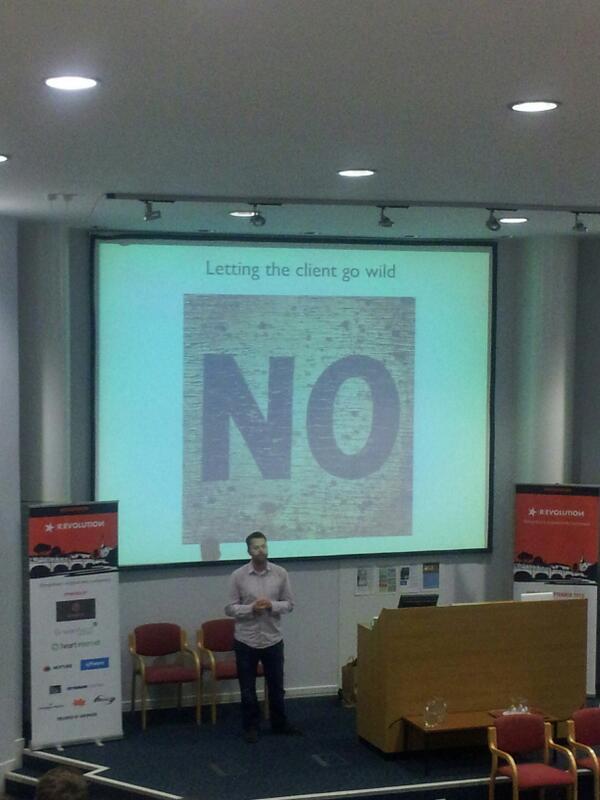
Well, where to start? Elliot Jay Stocks is a personal favourite of mine. I was so excited when I learnt from Kirsty that he would be presenting. Elliot took us through his personal decade of web design which including a lot of Flash!
Elliot got me thinking about how we need to work with other people who are experts in that particular field and the importance of working on different things so you don't go stir crazy.
Finally, I'd like to say that the (R)evolution conference really did give me some food for thought. I'd like to thank Kirsty Burgoine, Zach Beauvais and Pete White for putting on such a brilliant event and letting us be a part of it.