We want the new shropshire.gov.uk to look fantastic on all devices. This means paying special attention to displays with a high number of dots-per-inch (such as the Retina display on the new iPad), if we don't images and graphics are displayed with fuzzy edges (unacceptable!).
Our approach
It's best not to make a large graphic and scale it down (or vice-versa), as we've found it can produce irregular results. Instead we make every graphic twice, once at the regular size and once at double size. We then use pixel hinting (aligning the graphic to the pixel grid) to make the edges as sharp as we can.
We save a copy of each graphic for web use at 72 dots-per-inch and put '@2' at the end of the filename of the high resolution version (for example our logo files are named logo.png and logo@2.png, this isn't necessary but it makes file management simpler).
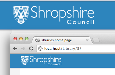
[caption id="attachment_962" align="aligncenter" width="336" caption="The Shropshire Council logo at normal (top) and high resolution (bottom) for comparison"] [/caption]
We specify the normal sized graphic in our main CSS file and use a CSS3 property called 'background-size' to tell the browser what size to render the graphic.
header h1 a {
 background: transparent url(img/logo.png) top left no-repeat;
 height: 24px;
 width: 100px;
 background-size: 100px 24px;
}
Using a media query we serve a CSS file only to devices with a high-DPI display.
<link rel="stylesheet" href="highdpi.css" type="text/css" media="only screen and (-webkit-min-device-pixel-ratio: 2)">
In this CSS file we use the cascade to override the statement in our main CSS file, replacing the standard sized logo with our high resolution version.
header h1 a {
 background-image: url(img/logo@2.png);
}
...and there we have it, a super crisp looking logo! Because we have specified background-size the high resolution graphic is squeezed into 50% of the space, rendering fine detail you can only see on high-DPI displays.
[caption id="attachment_977" align="aligncenter" width="400" caption="Comparison of the Shropshire Council logo on a normal screen and an iPad 3 (running on an iOS simulator)"] [/caption]
Problems with this approach
The way we are doing this isn't perfect, before we go live with the site we're looking for solutions to the following:
Background images only
We're still looking for a clean solution for inline images (<img>), particularly in situations where these are added through our content management system.
Limited browser support
This approach will only work with webkit and mozilla browsers at the moment (with vendor prefixes), until we see more browser vendors adopt the 'min-device-pixel-ratio' media query we can't rely on it and will use progressive enhancement to make sure older browsers still work fine.
Downloading two images
Unfortunately we send devices with high-DPI displays both versions of the image and this is terribly inefficient. We could target devices with standard resolution displays with their own CSS file to prevent this, which we'll look at implementing soon, once we can find a clean solution for legacy browsers.
<link rel="stylesheet" href="standard-res-graphics.css" type="text/css" media="only screen and (-webkit-min-device-pixel-ratio: 1)">
Maintenance and workload
We have to create our graphics twice, and maintain two graphics when we're updating the site. This could be avoiding by using a different image format such as SVGs (scalable vector graphics), which we're looking into in the future.