When we kicked off the 'recycling and rubbish' phase of new.shropshire.gov.uk, it was made clear during the analysis stage that a page would be needed to allow people to find out 'what can I recycle where?'.
This was to be an extension of the existing 'find my nearest' functionality - allowing the customer to find their closest recycling points based on the items they wanted to recycle. For example, if someone wanted to recycle their cardboard and electrical goods, the results would be a list of recycling points where both cardboard and electrical goods can be taken.
The idea was sound, but implementing it was an experience. Before we went live this particular page had a number of changes, each time with the aim of making the user experience easier and as intuitive as possible. This blog post will take you through those iterations and thought processes that made the page into what it is now.
How it first started out

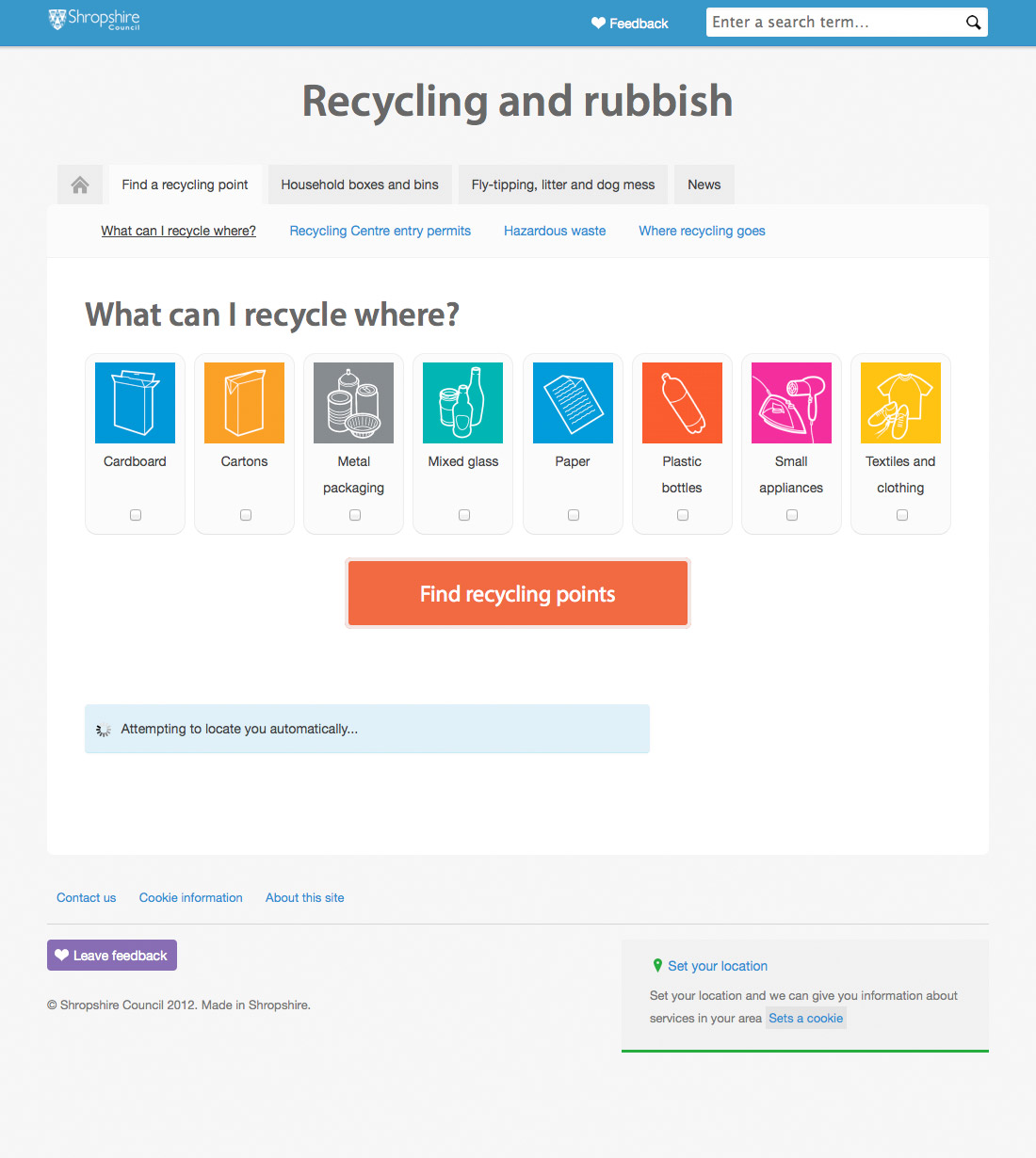
Screenshot 1The screenshot to the left (screenshot 1 - click for full size view) shows the initial design and specifically shows it as if someone had directly landed on the page.
In our original site structure this page sat under 'find my nearest', and because of this we wrongly assumed that if the customer had got to this point then it was likely that we already had their location, either automatically from their browser or from a manually-entered postcode.
This was a problem as there was nothing to stop someone selecting their chosen recyclables, hitting the find button and... well... nothing would happen. They would assume it was broken, and - from a user-experience point of view - it was.
We tried to get around this by automatically sending a location request if they had not already set their location (or previously rejected the request). However due to the design of the page, and the way browsers behave it may not have been obvious that a location request was being displayed or that a location was needed in order to use this service.
Evolving

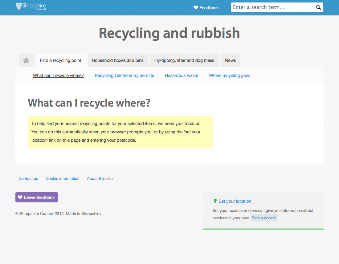
Screenshot 2We needed to change the behaviour of the page so that it would be more obvious that a location is required for this feature to work.
Our first thought was to disable the "Find recycling points" button if no location was set. We shot this idea down as it wouldn't have been obvious why the button is disabled. It also relied on the person noticing that their browser is asking them for authorisation that their position could be located automatically, or that they need to manually set it by entering their postcode.
Another approach that made it as far as a working prototype (as screenshot 2 shows), completely hid the recycling options and "Find recycling points" button if no location was set. Instead a brief message was displayed describing why this feature needs to have a location, and a brief "how-to" to set it automatically or manually.
The lifetime of this design lasted about 10 minutes after we built it, because we quickly discovered it was a horrible method of fool-proofing the interface!
The problem with this approach was that it:
- lost the focus about what the page is for - giving the customer the ability to quickly & simply find a recycling point based on what they want to recycle - not giving them a crash-course on how it works
- added more than a few usability and accessibility concerns - the message and a lack of the expected content could be misinterpreted as a "broken" page, plus we should be making it easier to use, not adding more steps to the process
- disrupts the continuity of the page (unexpectedly hiding and displaying huge chunks of page content is not good practice)
Evolving in a better way
Over and over, the main problem that kept on cropping up was handling the way a user sets their location if it hadn't already been set. Instead of relying on the separate methods we had been using, we realised we can do all this (set location and lookup recycling points) in one 'click' while maintaining the continuity and purpose of the page.

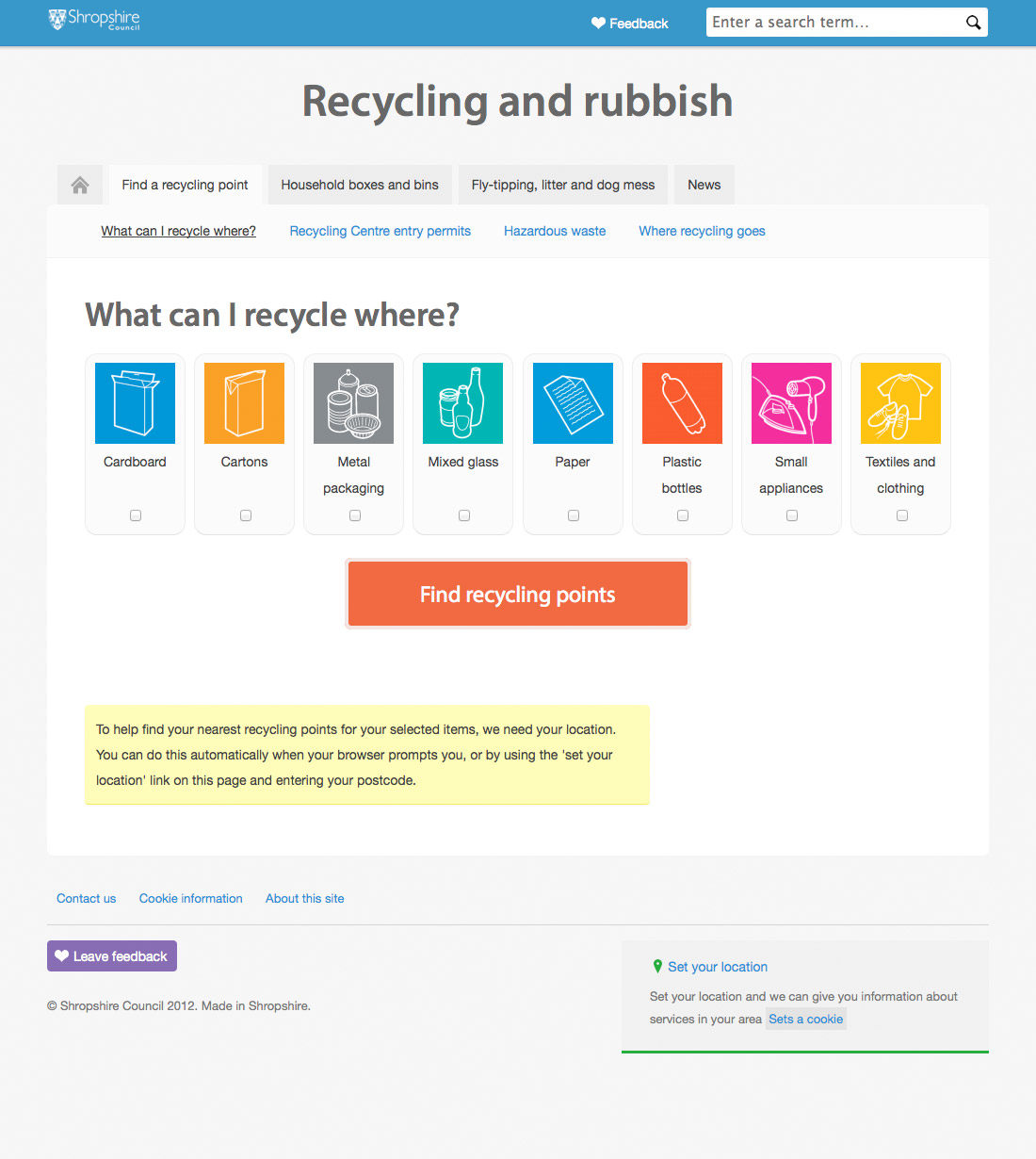
Screenshot 3Effectively, we decided to double up the functionality of the "Find recycling points" button.
Now, when someone visits this page we display the recycling options and button as normal, and, for the situation when a location hasn't been set, we also display the informative message from our previous design.
However, when someone clicks the "Find recycling points" button the code behind it checks to see if they have a location stored already. If they do, then the recycling point lookup will run straight away. If they don't then they are (re)prompted to set it, and, once set, the recycle point lookup runs automatically.
This way something will always happen when the button is pressed, maintaining the expectations of the person using this page, and reducing the complexity of the process overall (for us developing it, and for the people using it).
Covering all angles

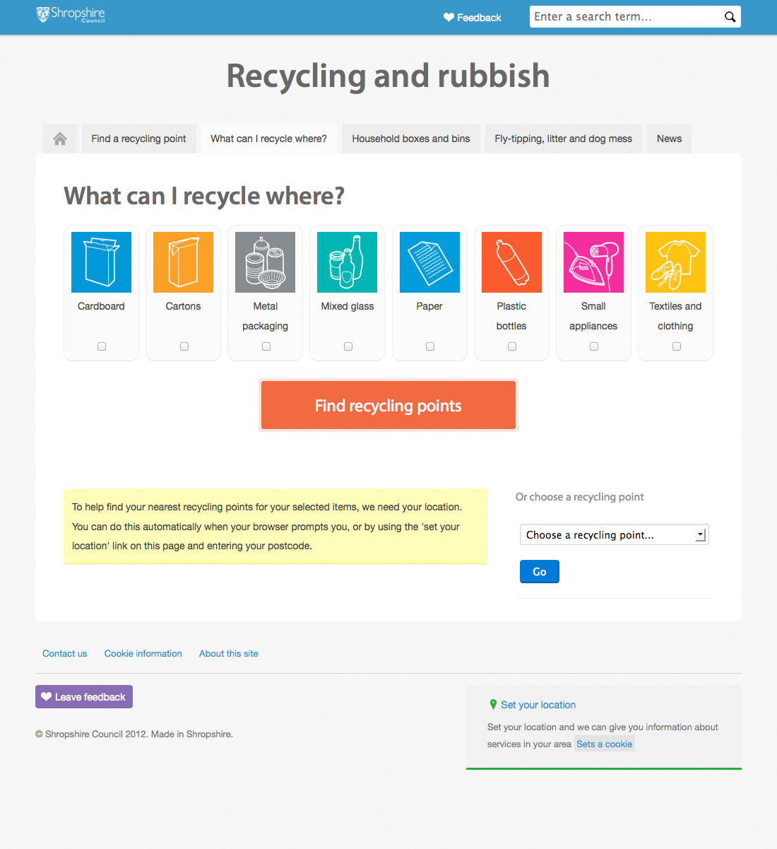
Screenshot 4There is still one case which we have yet to cover though. What if the customer does not want to share their location or can't set it for some reason?
That one was easy, and was something we had already implemented on our "Find my nearest" page - we provide them with the utility to manually chose a recycling point from a drop down list.
It works, but will people know where to find it?
After putting in a lot of effort to get it working, we wanted to make this service more prominent. In it's current location it was overshadowed by the 'find my nearest' feature (its parent page), so we moved into the top level of 'recycling and rubbish' - making it a tab visible no matter where you are on this section of the website.
We're not done yet...
Given the timescale we had for this particular section of new.shropshire.gov.uk, we spent an awful lot of effort making this and other pages look and behave as simply and effectively as possible.
There are still many things we would like to add to this page, such as allowing people to look up other items that may or may not be recycled (e.g. donating furniture to a local furniture scheme or disposing of a mattress), and no doubt we will be revisiting this again to do just that at some point in the future. But one thing is for sure - we only want to make things better for the people using our website, and we are always willing to listen to comments and suggestions.